We all know by now the color of the year is Pantone greenery and along with the exciting change in seasons, is Pantone’s color report for Spring 2017! If you’re in the middle of planning a kitchen or bathroom remodel or thinking about starting one soon, here are some fun design ideas showcasing the new lineup.
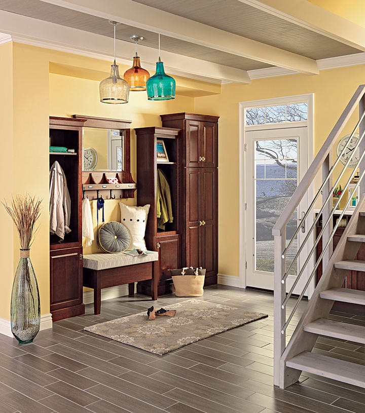
How about adding some cheer with Primrose Yellow (Pantone 13-0755) to your kitchen, foyer, mudroom or bathroom? It’s like a bright ray of sunshine!
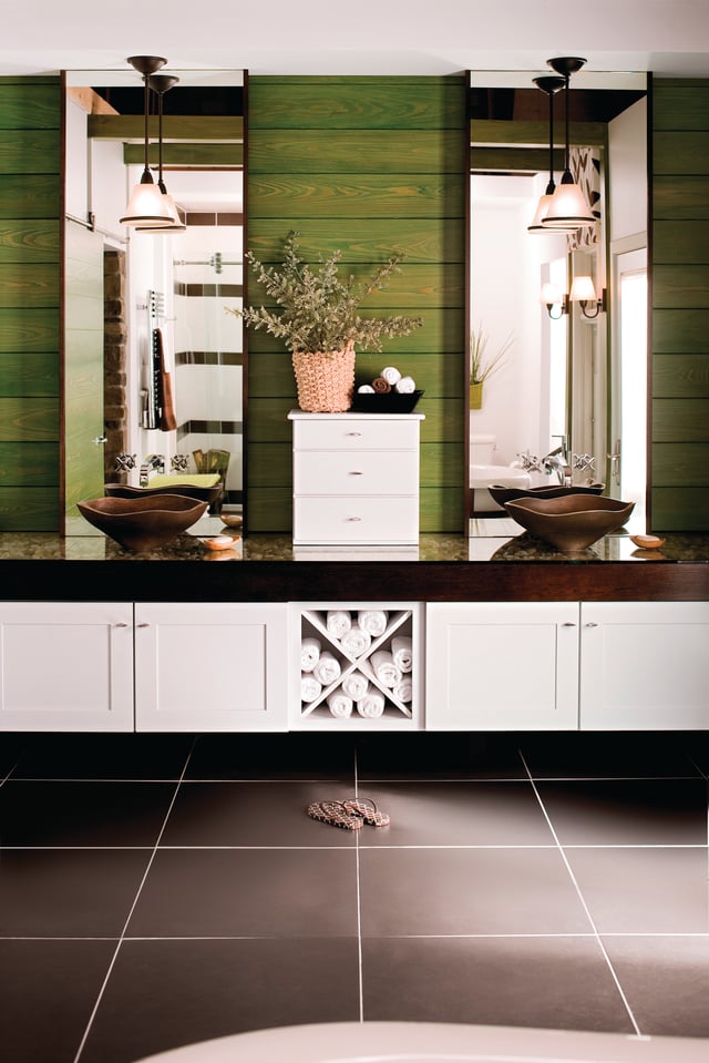
If you’re more of an “earthy” eco-friendly, whole foods kind of person, you may appreciate the subtleties of Kale (Pantone 18-0107). It’s not only reminiscent of a healthy Kale salad but of the green shades of nature – let’s bring all that warmth indoors!
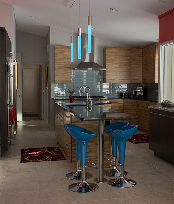
In this contemporary kitchen with its clean lines and idyllic simplicity, Springs Lapis Blue (Pantone 19-4045) adds a pop of color that makes this space interesting and full of energy.
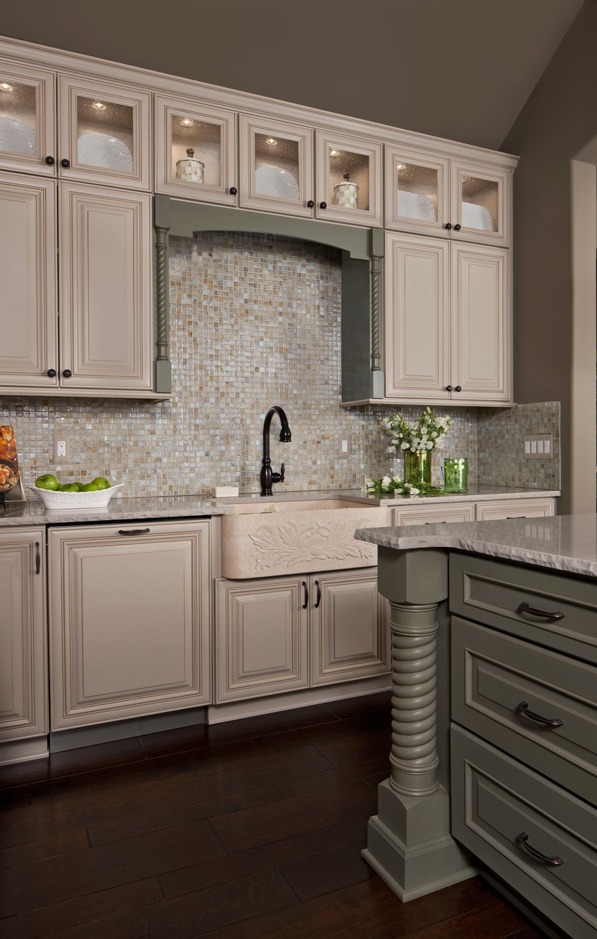
If a calming, natural shade is more your taste than you’ll love that Pale Dogwood is on the runway for Spring 2017. This traditional style kitchen marinates with a soothing palette and enjoys a balance of classic and formal. The creamy sink with its beautiful architectural detail changes the whole feel from a work center to a beautiful and decorative centerpiece.
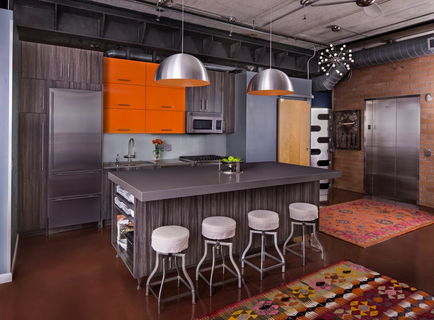
Orange isn’t just for Halloween anymore! If you’re a fan of power colors like red, you’ll love this new red-based orange, Flame (Pantone 17-1462). In this beautiful contemporary kitchen with its focus on simplicity and clean lines we love the pop of bold orange color against the more neutral backdrops. Shapes are geometric, sleek and fresh. Less is more.
No matter which one of the Spring Color 2017 shades spoke to you, the important thing is to create a space that is your refuge. Create a space that makes you feel comfortable, perhaps peaceful, and at the end of the day, a space you enjoy spending time in.


