
Mari Margaret is an award-winning Senior Designer at KSI's Birmingham Design Center.
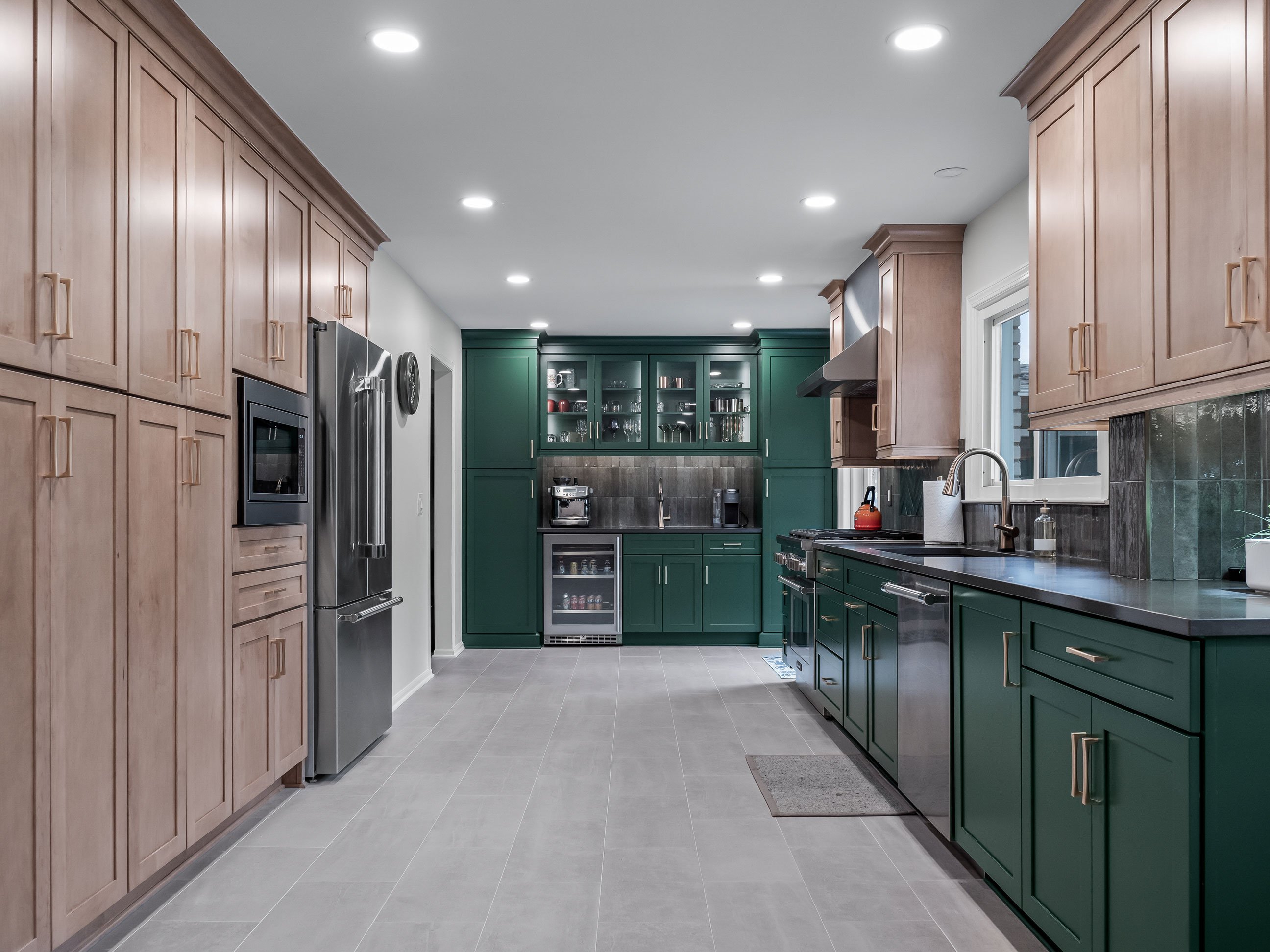
This year we’re seeing a lot of interest in bold colors in general, and greens in particular. When Beth and her husband Brian came to me with her kitchen remodel, I was excited to work with clients that not only wanted to increase organization and functionality in their kitchen, but bring it to life with bold color!
At our first design consultation, Beth fell in love with deep green cabinetry that we have on display in the foyer of our Birmingham Design Center. We wanted to go bold, eventually landing on Sherwin Williams Evergreen as our statement color – a vibrant green that really resonated with Beth (who happens to also be a big Spartan fan!).
In this project, we didn’t want it to be over the top – so it was important to be tasteful with the rest of the palette in the space. We offset the green with natural maple cabinetry in Shortbread stain for the dining area, refrigerator wall, and perimeter wall lower cabinets to achieve balance. In choosing the floor in this space, we needed to select tones that would allow the green cabinetry to pop without competing with the maple. For a timeless shaker look, we utilized Merillat Masterpiece cabinetry in the Martel door style.
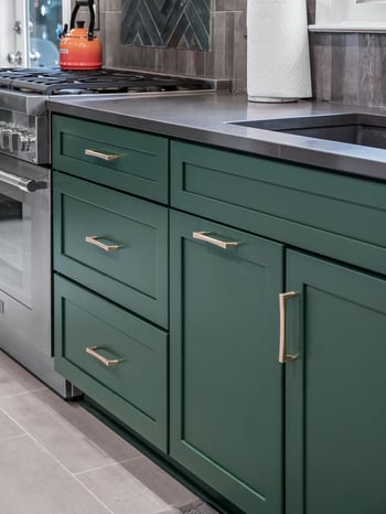
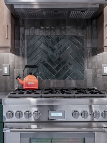
Our countertop selection was a dark engineered quartz from Solid Surfaces Unlimited called Cinza. The backsplash here was really fun! We needed a darker tile to go with the countertop and ground the space with a dark and moody feel, which we accomplished using a rustic porcelain ceramic tile called Soho-Noho Brick Effect in Taupe from Beaver Tile. I wanted to break it up with a focal point above the stove, so we created a herringbone pattern in Emerald that lifted the green of the base cabinets up into the backsplash, tying everything together.
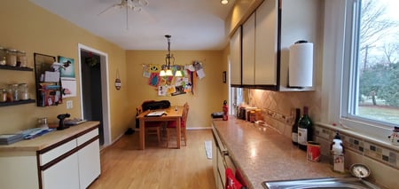
Beyond aesthetics, a key part of my design process was to understand Beth’s pain points with the original kitchen. Many of the issues revolved around lack of storage and poor flow of the space that just didn’t work for her family.
As part of the remodel, we made the decision to remove a wall between the kitchen and dining room to open up the space. During demolition, we discovered a pipe in the wall that could not be moved. With some clever troubleshooting in the field, we were able to conceal it inside the cabinetry and backsplash without compromising on the vision for an expanded space.
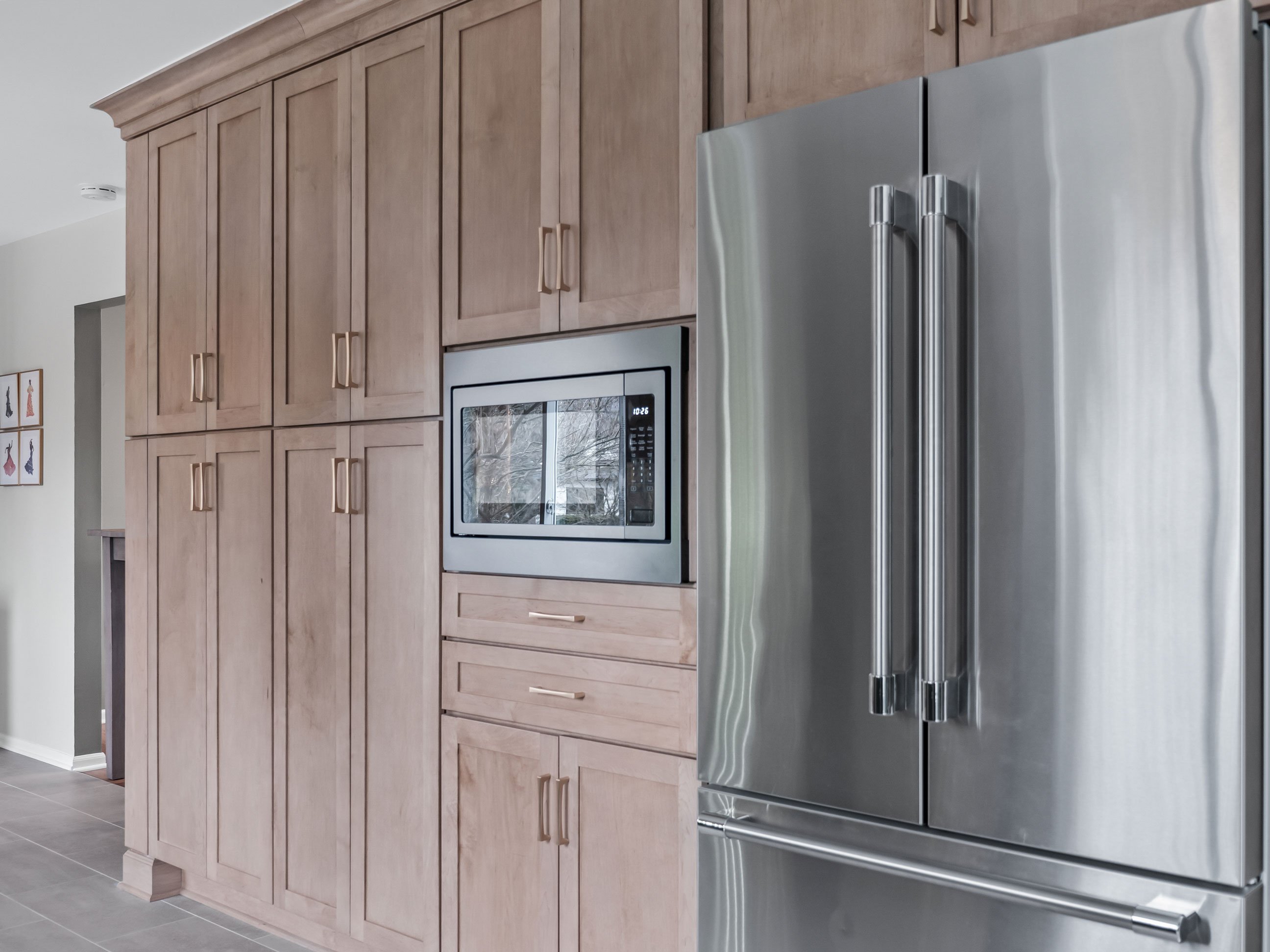
One of the most important organizational and functional challenges for this space was to provide more storage for all the pantry items and appliances Beth had been keeping in the basement due to lack of storage. Adding a wall of cabinetry with rollout drawers created storage space for all these items to get them into the kitchen where they belonged, and up out of the basement!
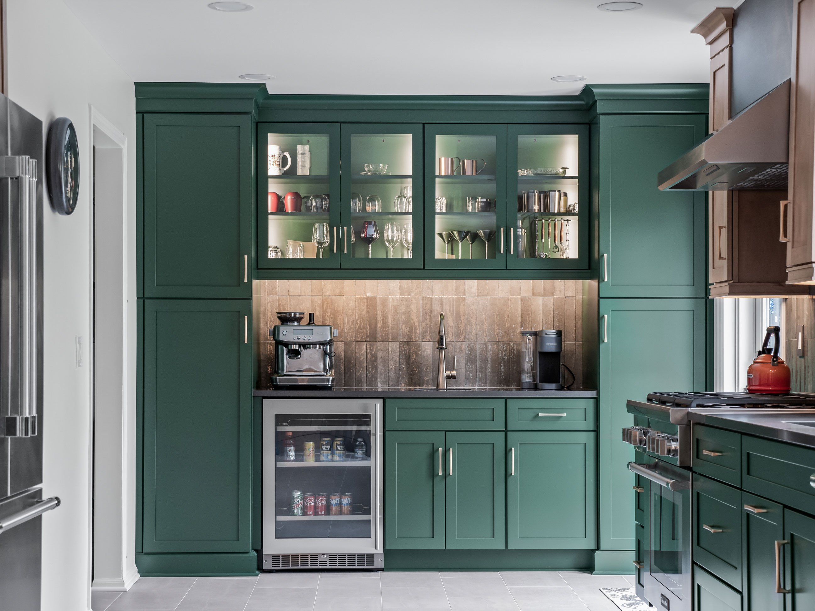
For entertaining, we added a beverage center statement piece featuring green cabinets and glass doors that showcase the clients’ drinkware.
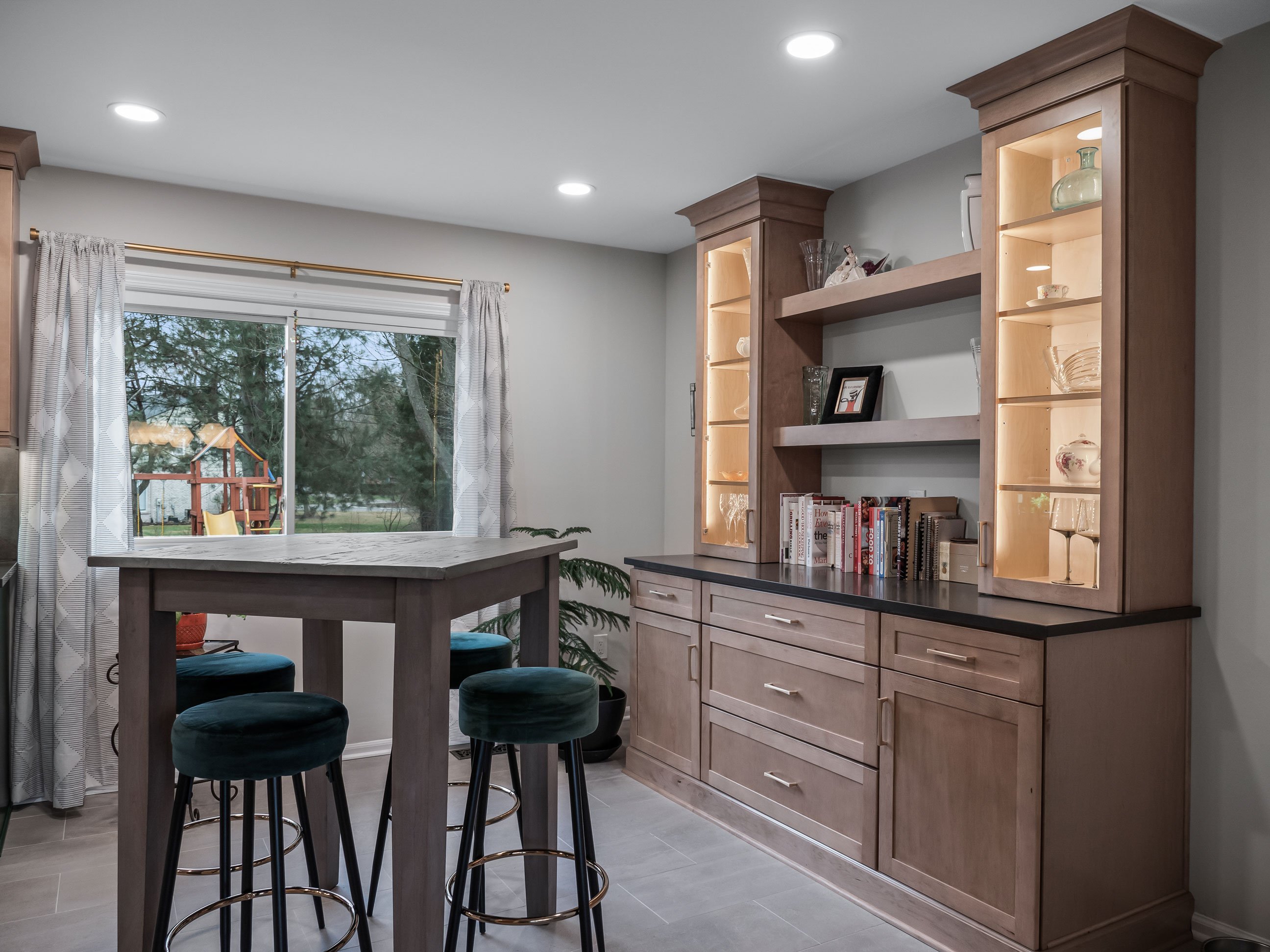
On the opposite wall we balanced the beverage center with maple cabinetry in the dining area.
Sometimes the best organizational solutions are the ones you don’t see. One of my favorite aspects of this project was the opportunity to include a message center, or what I like to call a “Mom Center”, where the exposed side of a wall cabinet run can have a side door that features a shallow shelving area perfect for chargers, devices, keys, and all the little items you might otherwise find lying on a table or countertop.
When you’re working with strong, bold colors, you need to edit your design to achieve balance. You want to make a statement without overwhelming the space, so finding that happy medium is really important. Making sure that beautiful space is also functional and solves all the challenges with the old space is key to getting the maximum value out of your kitchen remodeling investment. That’s why you want to work with a professional! Beth entrusted me with the design and execution of her new kitchen, and it was wonderful working with her to develop a new space that met the needs of her and her family.
