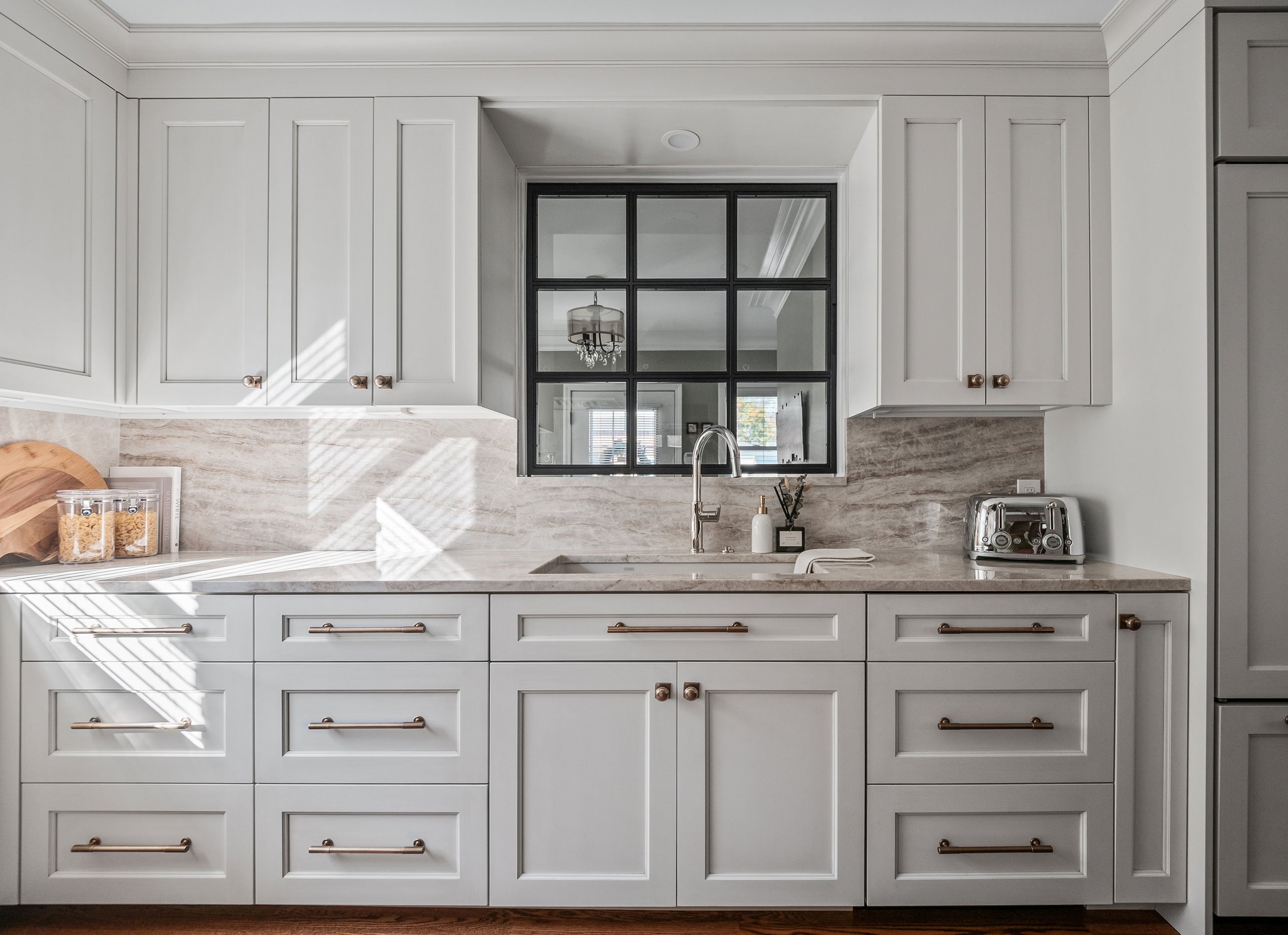
When my client came to me with her kitchen remodel, she emphasized a desire for a timeless space that would match the character of her home while being strategic with storage. Working in a smaller kitchen, we needed to use every inch of the space to maximize functionality while creating an open, lighter feel. It was an exciting challenge to get creative with storage solutions and make sure that every corner had a purpose!
Starting with Style
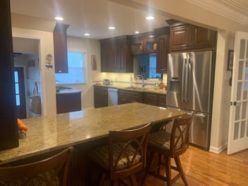
My client was eager for a refresh. The existing kitchen had really dark wood cabinetry with dark countertops. We wanted to integrate some of that dark, but also lighten things up a bit.
Lighter tones always help to open up a space, and that’s especially true in a small kitchen like this one. Here's a look at some of the key choices we made to bring a brighter, timeless look to the space:
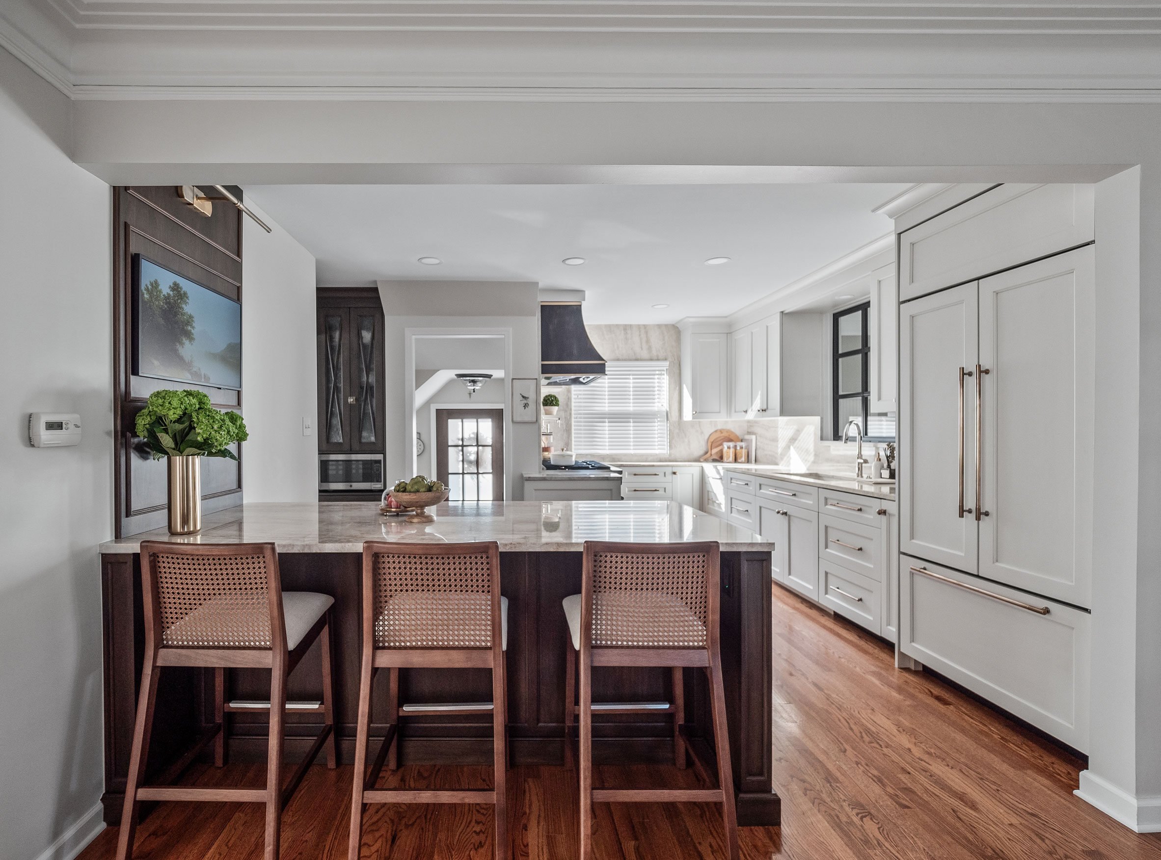
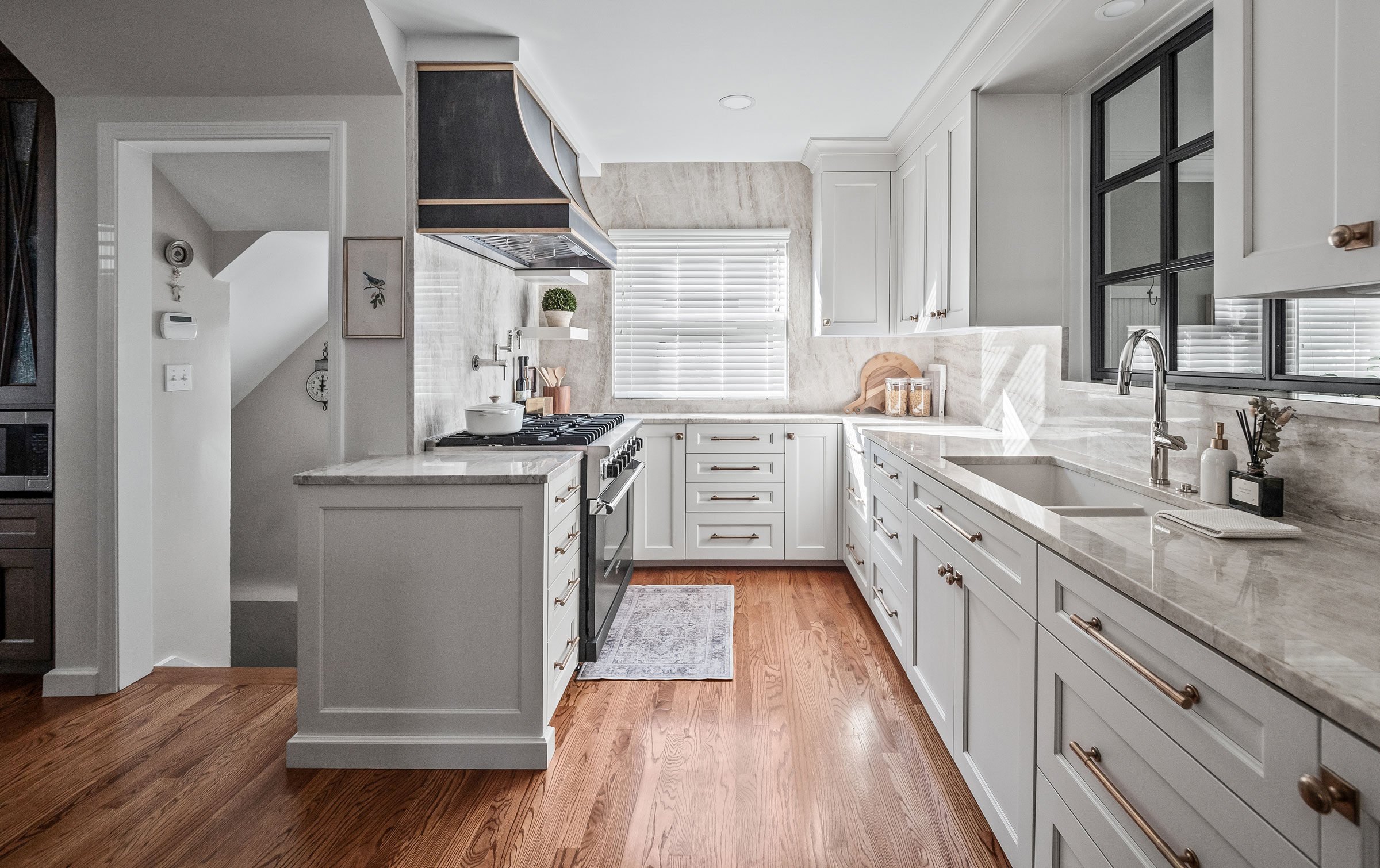
A stark white wouldn’t fit the charm of the house; we gravitated towards soft whites with accents in rich warm tones. We selected a white cabinet with a little glaze on it, and then added walnut for the peninsula and armoire to really create a classic, timeless look.
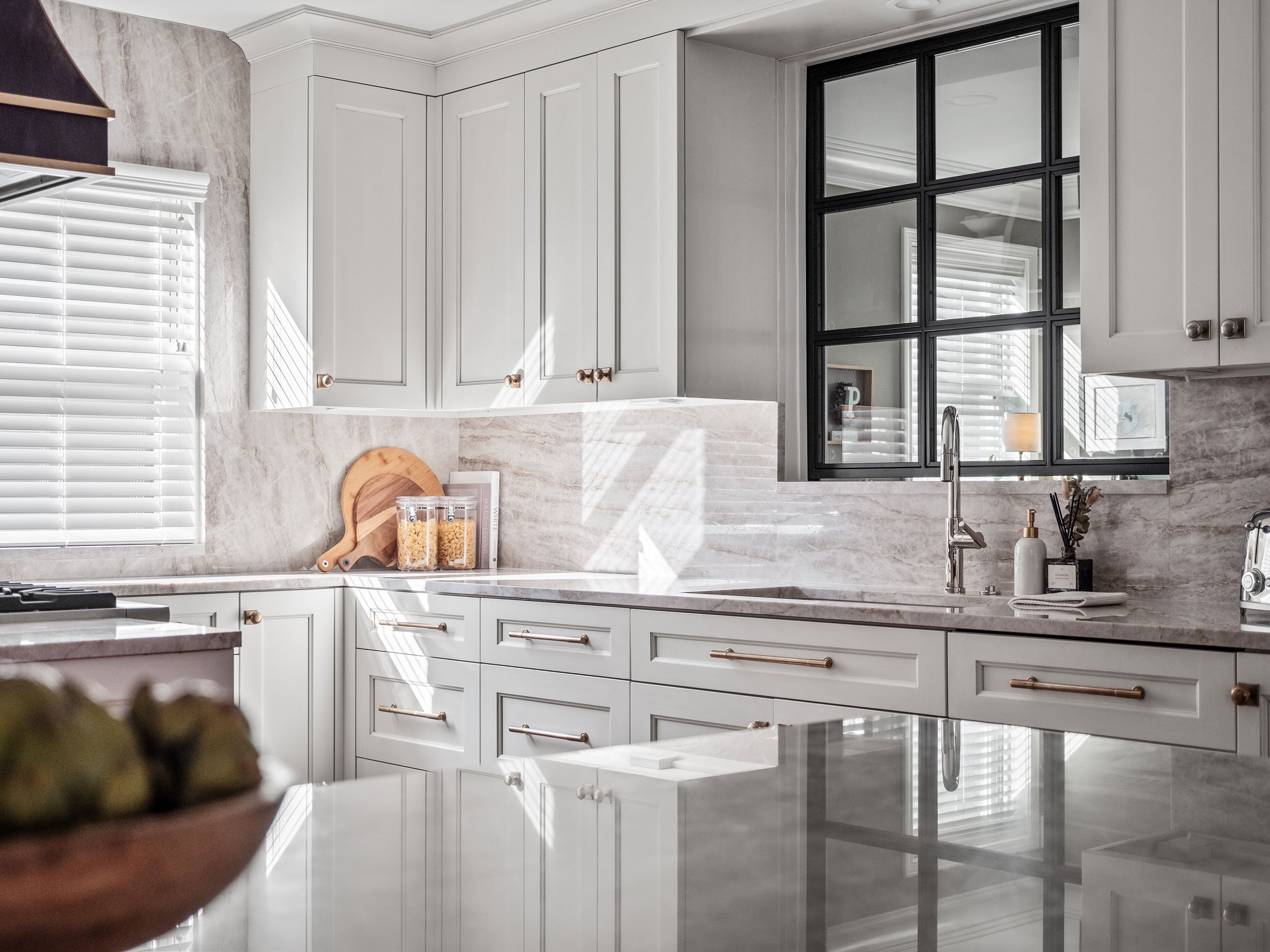
We looked at many different stones for the countertops, with our ultimate selection having a classic and warm feel while also being light and refreshing. We didn’t want to mix too many different textures, so a backsplash with decorative tile was going to be too much. We decided to bring the stone all the way up the wall with full height backsplashes.
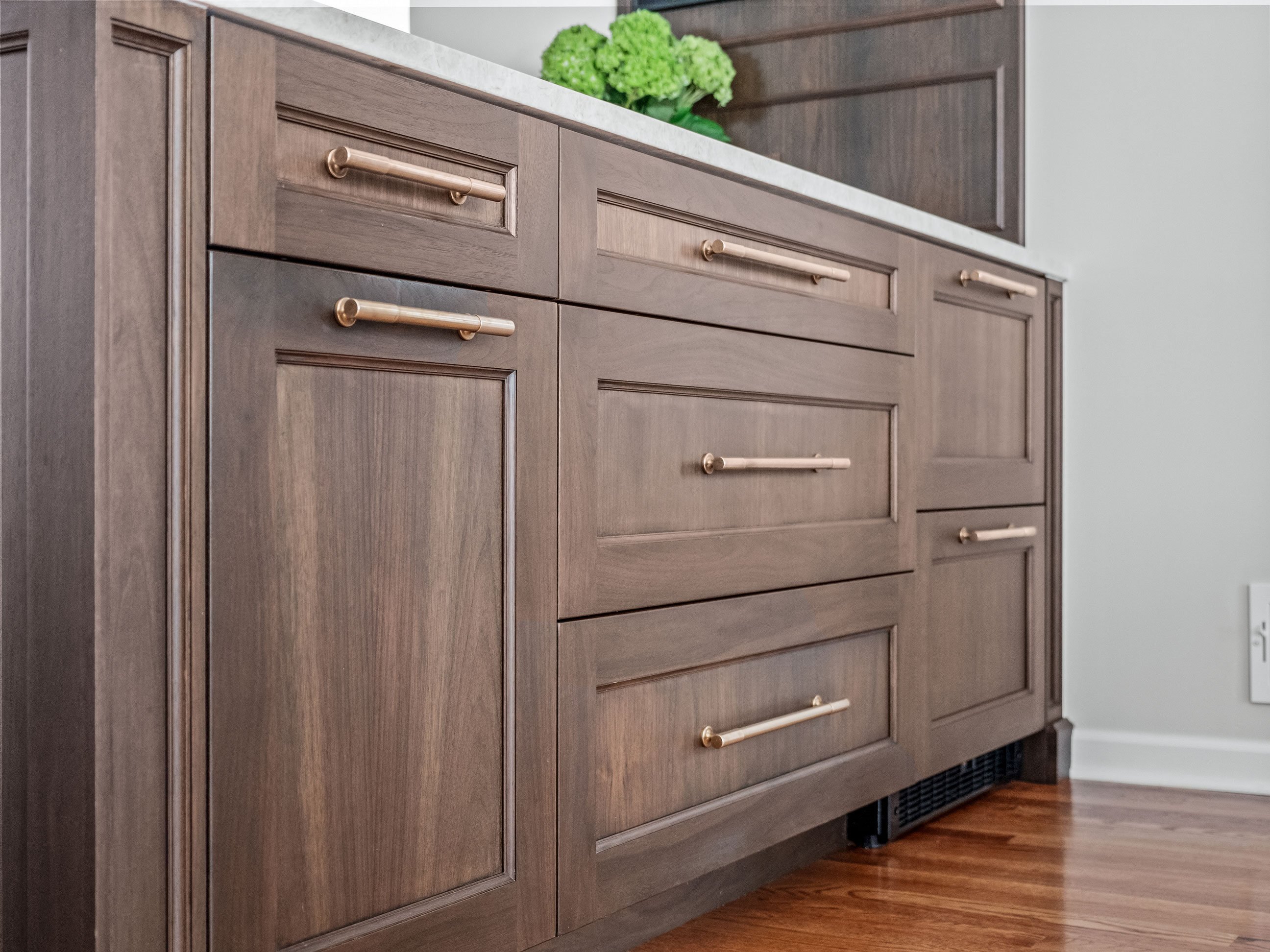
When it came time to look at hardware, we found that chromes and satin nickels seemed too much. An antique brass made the perfect finish to play with knob, handle, and touch latch options set off from white and walnut cabinetry throughout the space.
 For the hood we wanted something that really fit the space and wasn’t too contemporary. The unique texture and feel of a metal hood accented with brass straps really tied it all together!
 The cabinetry in the hallway just outside the kitchen gave us the opportunity to create a statement piece. While the cabinetry finish matches the walnut of the peninsula to tie it into the space, the mullions, decorative glass, and a different latch make it stand out as its own piece with an armoire look.
Storage & Function
 One key area where we could increase storage was below the window, where there previously wasn’t any cabinetry. We added shallow-depth cabinetry that allowed us to utilize the space for smaller drawers where she could store her spices and wrap the countertop around the perimeter of the kitchen. We customized the shelving in the corner cabinet so we could utilize the full corner space, perfect for extra baking supplies.
 For a thin space by the range, we used a pullout instead of a filler to maximize functionality. With its proximity to the corner, the pullout was only accessible on the range side. We added a back panel on the other side so spices wouldn’t fall out, providing a creative solution that allowed us to maximize the functionality of the ultra thin space. We also added some plywood shelving panels in the tray storage cabinet so it wasn’t just one level, essentially doubling the tray storage in a small space.

In the original space, the kitchen had a pass-through into the home office. It was a unique feature, but if someone was working at home while another was trying to cook, it just didn’t work. We wanted to create a solution that looks like it was incorporated into the design like a window above the sink. Initially we envisioned a bifold door that would slide open to provide either access or privacy between the kitchen and office. Once we started playing with it in the space, we decided a better solution would slide completely into the wall and out of the way. We switched gears to a pocket door window – that way the client can have it shut for privacy or open and uncluttered for a pass-through.
Tying it All Together
The biggest challenge with this project was how to make the most out of a small space. When adding cabinetry and changing a floorplan, you always have to make sure that the walkways are still good for guests and entertaining. Making sure we were utilizing every space we could without intruding on the walkways was critical, and in keeping everything as functional as possible in a smaller space, I think we did a good job! My client was delighted with the end result, bringing timeless style and much-needed storage to her cozy kitchen.




 For the hood we wanted something that really fit the space and wasn’t too contemporary. The unique texture and feel of a metal hood accented with brass straps really tied it all together!
 The cabinetry in the hallway just outside the kitchen gave us the opportunity to create a statement piece. While the cabinetry finish matches the walnut of the peninsula to tie it into the space, the mullions, decorative glass, and a different latch make it stand out as its own piece with an armoire look.
 One key area where we could increase storage was below the window, where there previously wasn’t any cabinetry. We added shallow-depth cabinetry that allowed us to utilize the space for smaller drawers where she could store her spices and wrap the countertop around the perimeter of the kitchen. We customized the shelving in the corner cabinet so we could utilize the full corner space, perfect for extra baking supplies.
 For a thin space by the range, we used a pullout instead of a filler to maximize functionality. With its proximity to the corner, the pullout was only accessible on the range side. We added a back panel on the other side so spices wouldn’t fall out, providing a creative solution that allowed us to maximize the functionality of the ultra thin space. We also added some plywood shelving panels in the tray storage cabinet so it wasn’t just one level, essentially doubling the tray storage in a small space.