
Jessica Garst is a Designer at KSI's Ann Arbor Design Center.
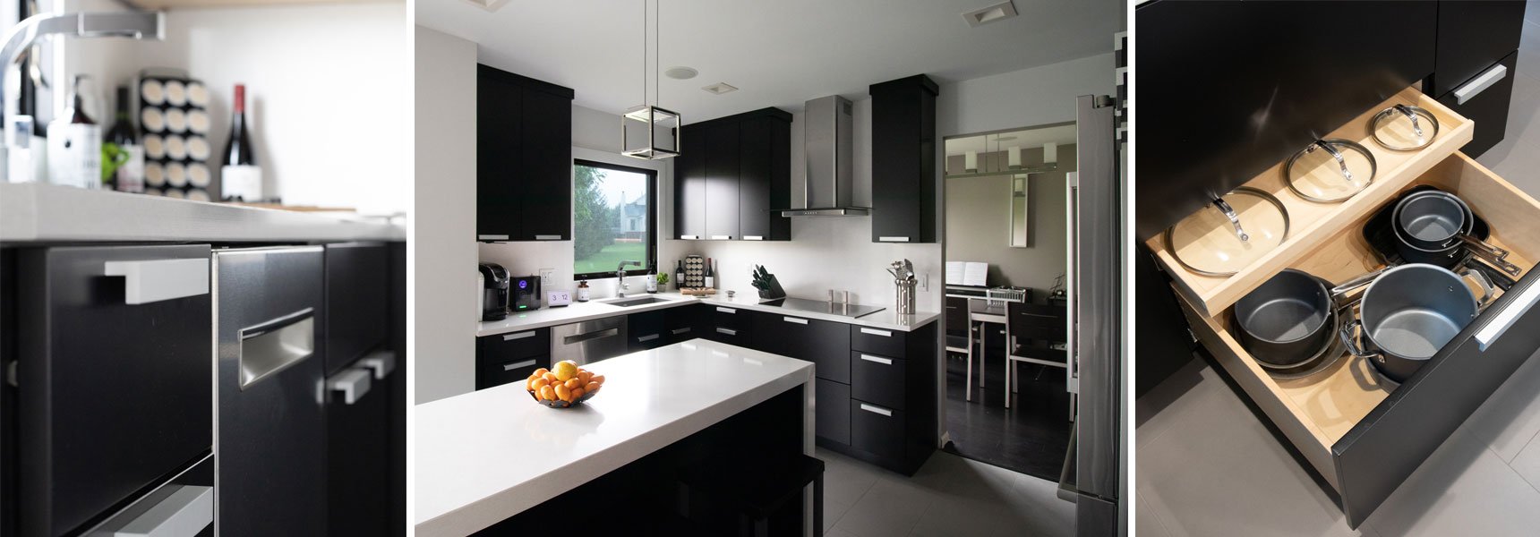
From the start of our initial consultation, I knew this client was looking to transform their home with a distinctive kitchen and bath remodel! Jeff went on to describe how he and his wife Jan wanted a clean, modern look. But with a long list of desired appliances, and a modest footprint to work with, how was I going to achieve that minimalist contemporary look?
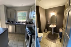
When Jeff came into the design center for his initial consultation, he brought along with him some rough dimensions, photos of the existing space, an appliance wish list, and some inspiration photos of kitchens that he and Jan really liked. All of their photos depicted large modern kitchens with frameless cabinetry and a consistent black, white, and gray theme. He really liked the look of 3” thick countertops and wanted waterfall edges on both sides of his island. Another must-have was a decorative range hood over a cooktop for a focal point in the kitchen. A small bathroom on the first floor would also be remodeled with a complimentary modern design. The rest was up to me to figure out!
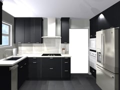 Following our consultation, I went to the drawing board to come up with a design that would reflect their personal style and taste while keeping their wish list in mind. I was so excited to take on this project because I love the challenge of creating a modern kitchen with open spaces, minimalist features, and simple color palettes. It's important to get creative with storage so that you can take the clutter out of the space and create a relaxing environment.
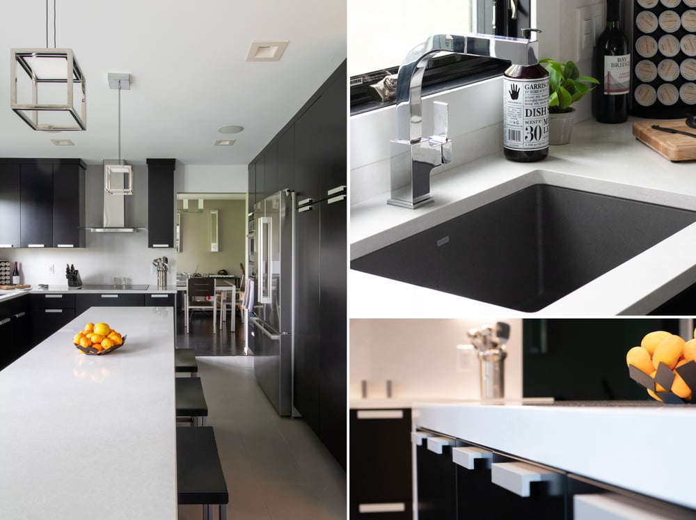
To achieve a modern aesthetic, Dura Supreme's Bria cabinetry provided the perfect look, while its full-access design eked out a bit more storage space as well! We used their Chroma door style finished in black paint and decorated with matte chrome hardware. For contrast on the countertops, we selected Cambria Quartz in Newport with an eased edge and full-height backsplashes. A Blanco Precis composite single-bowl sink in concrete gray makes an elegant statement.
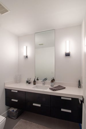
Just around the corner from the kitchen, we continued the modern design theme into the adjacent bathroom.
The biggest design challenge was fitting all the client's desired appliances into the design when working with such a small space. I worked closely with Ryan Quinn at Big George’s to ensure that the refrigerator door could open all the way without swinging into the handle on the oven/microwave because the space was so tight and the appliances were very close together.
We had supply issues as well - the the timeline was drawn out due to supply chain issues regarding the appliances. The dishwasher took a year to come in!
Jeff and Jan were working with Tom Blasiak with Blasiak Builders, who came highly recommended from one of their friends. Tom was great to work with during the installation process. We collaborated on details as the cabinets and trims were going in to ensure the finished look was what was intended in the design, and it turned out wonderful!
I enjoyed working with Jeff and Jan, they were very easy going and they know what they like and what they want. It made bringing their dream kitchen to life that much easier! I loved the challenge of making a small kitchen look big all while incorporating their appliance wish list into the design, providing them with enough counter space for prepping and cleaning, and achieving that modern, minimal aesthetic.
