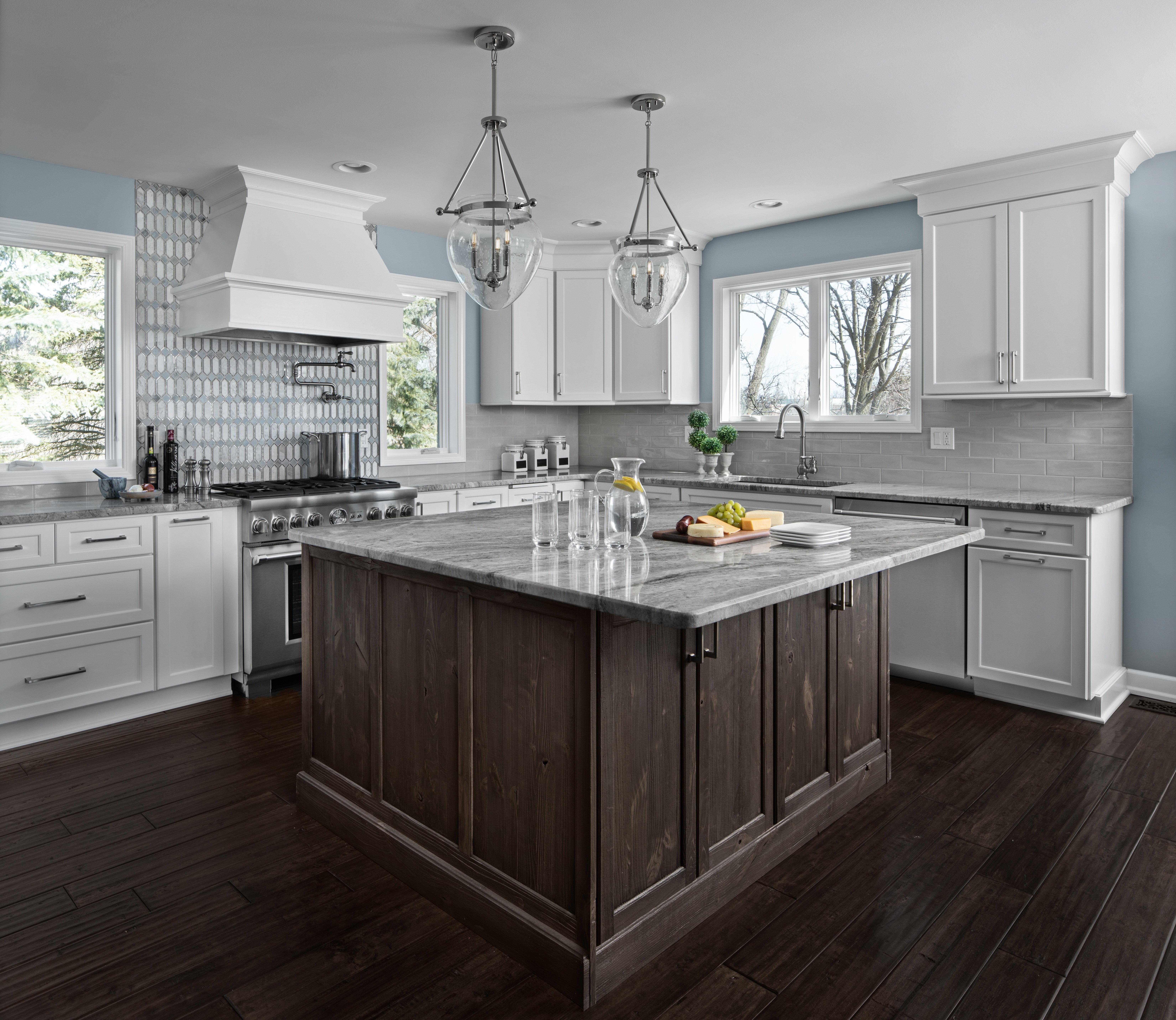
One incredible home remodel
At the start of any home remodel project the test of a really good designer is their ability to delve deep into the discovery process to uncover not only the family’s desires and wishes for the space, but learning how they function in the space. What does a typical day look like? Do they entertain a lot? Are there kids that need space to do homework? This project was no different. KSI Designer, Brooke Dando did a great job uncovering how this family uses their space. Unlike most kitchens, these homeowners were preparing meals at home on average, once-a-year. However they do love to entertain. In the previous small kitchen all the guests ended up huddled in this space. The goal was to move them out into other areas of the home.
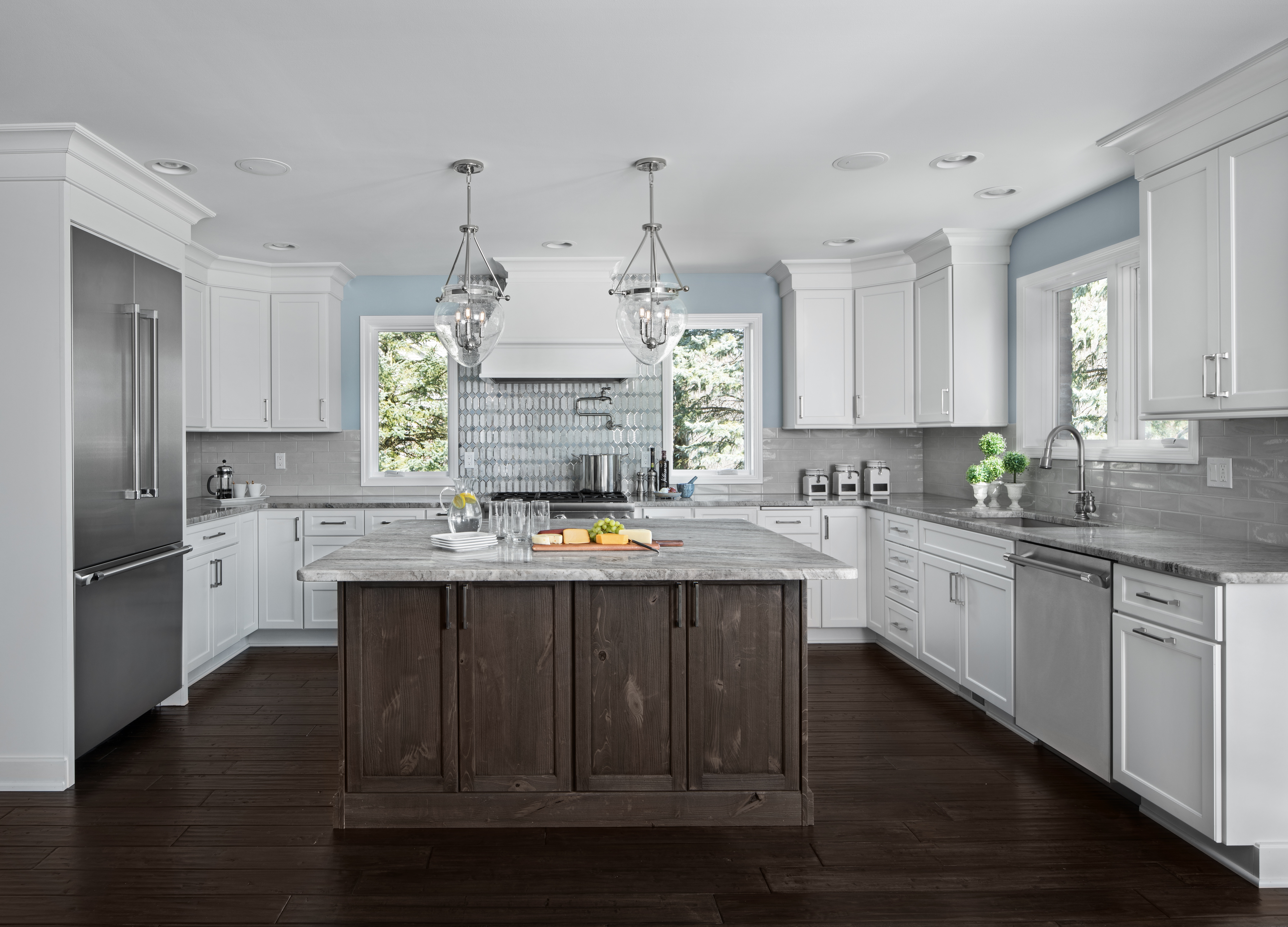
The original natural cherry cabinets were replaced with a nice bright Dura Supreme Kendall shaker door style in white. They chose a contrasting Dura Supreme Kendall in a knotty pine for the island.
Because the homeowners don’t cook much, they went with smaller Thermador 36” appliances throughout. Designer Brooke Dando had the builder move windows further down along the range wall to make room for the large range hood. Now it sits nicely centered between the windows, allowing lots of natural light and highlights the accent tile behind the hood. Definitely the focal point and a show stopper.
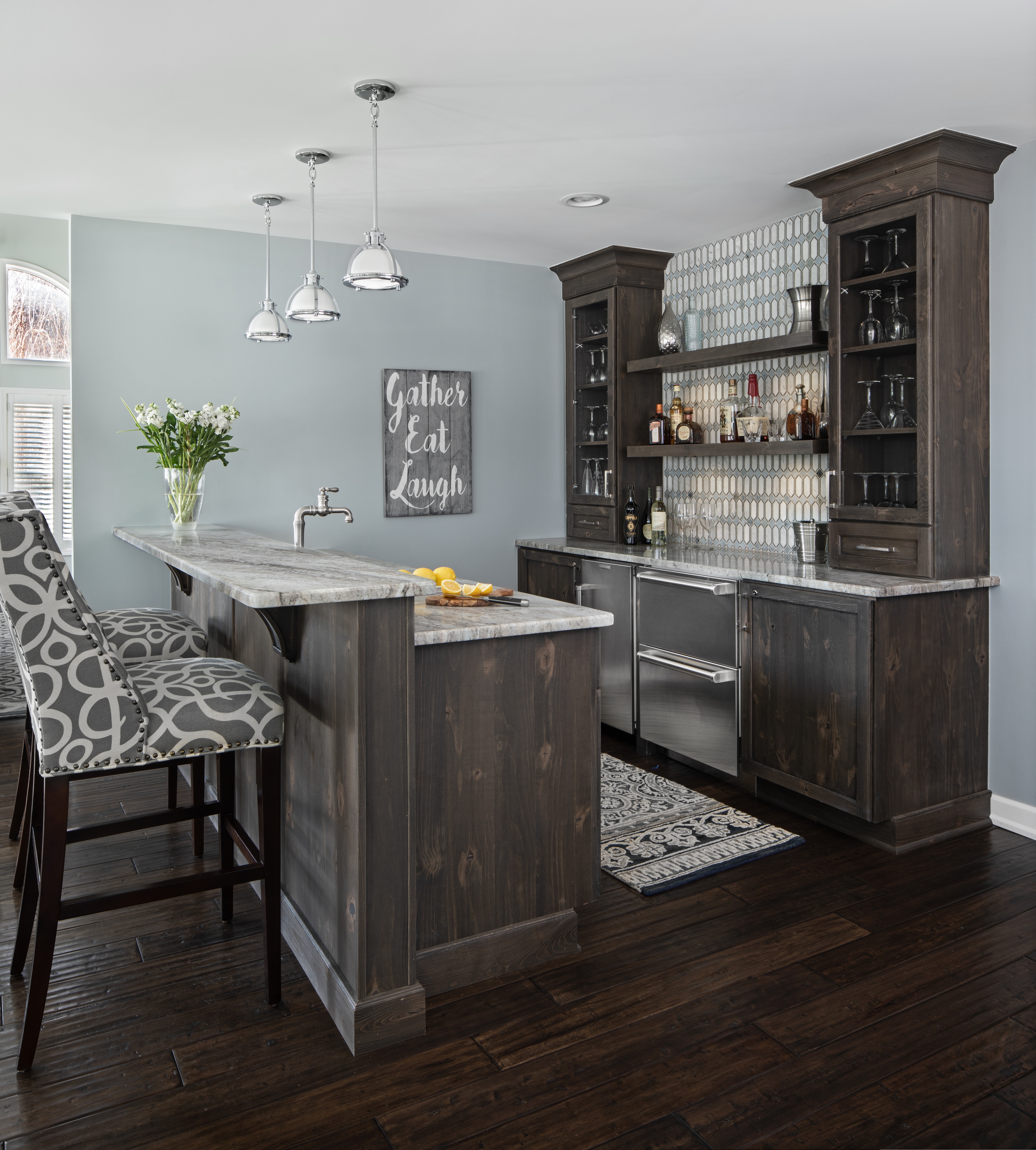
The goal was to move people out of the kitchen, therefore there are no chairs at the island but you’ll find plenty of seating at the bar, the dining room and the lounge – still close enough to the kitchen allowing people to move freely to grab a quick bite or beverage.
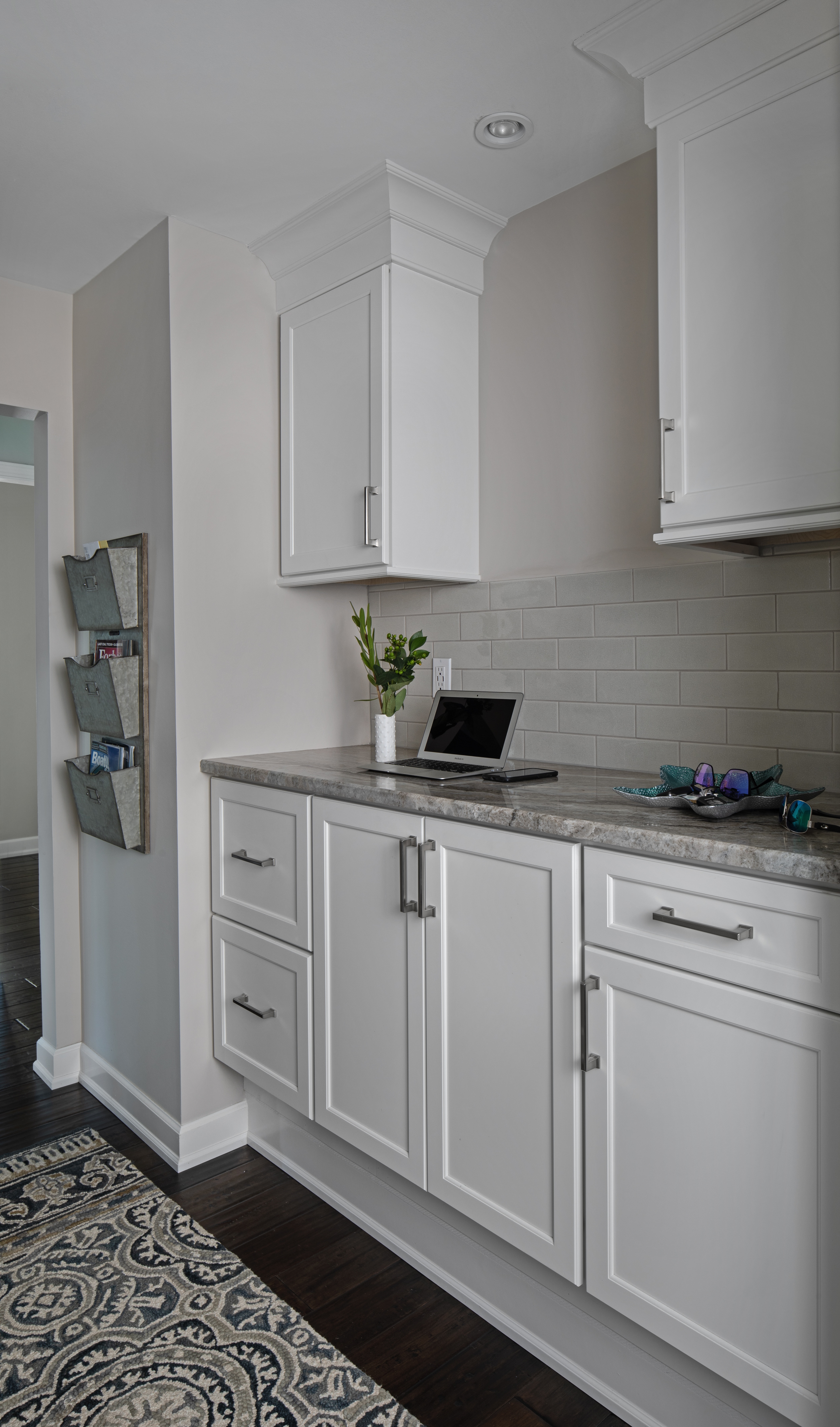
In every home, there is that space we all enter, whether it’s through the laundry room or mudroom, where we drop our coat, shoes, and the mail. Brooke designed what she termed a “Drop Zone” for this homeowner because as busy dentists, they wanted a space that was not only inviting but functional for their busy lives. Brooke chose a cabinetry design and countertop height of 42” high vs. the 36” standard to replicate the counter in their dentist office. This isn’t a space where they wanted seating. It’s a standing work space complete with under-cabinet lighting for ease of reading and recording notes in patient charts. There’s a place for everything, including a charging station for all their mobile devices. Brooke chose a Dura Supreme, Kendall white cabinet that ties in with the nearby kitchen while contrasting and anchored by the hand-scraped oak laminate flooring in a dark, matte finish.
Before you start your next project, be sure to sit down with a designer who can guide you through the process ensuring that it's designed to your taste and how you use that space.
For more design ideas for your next project, visit the kitchen and bath gallery at ksikitchens.com/gallery.
Not sure what your style is? Try out this fun Define Your Style App.


